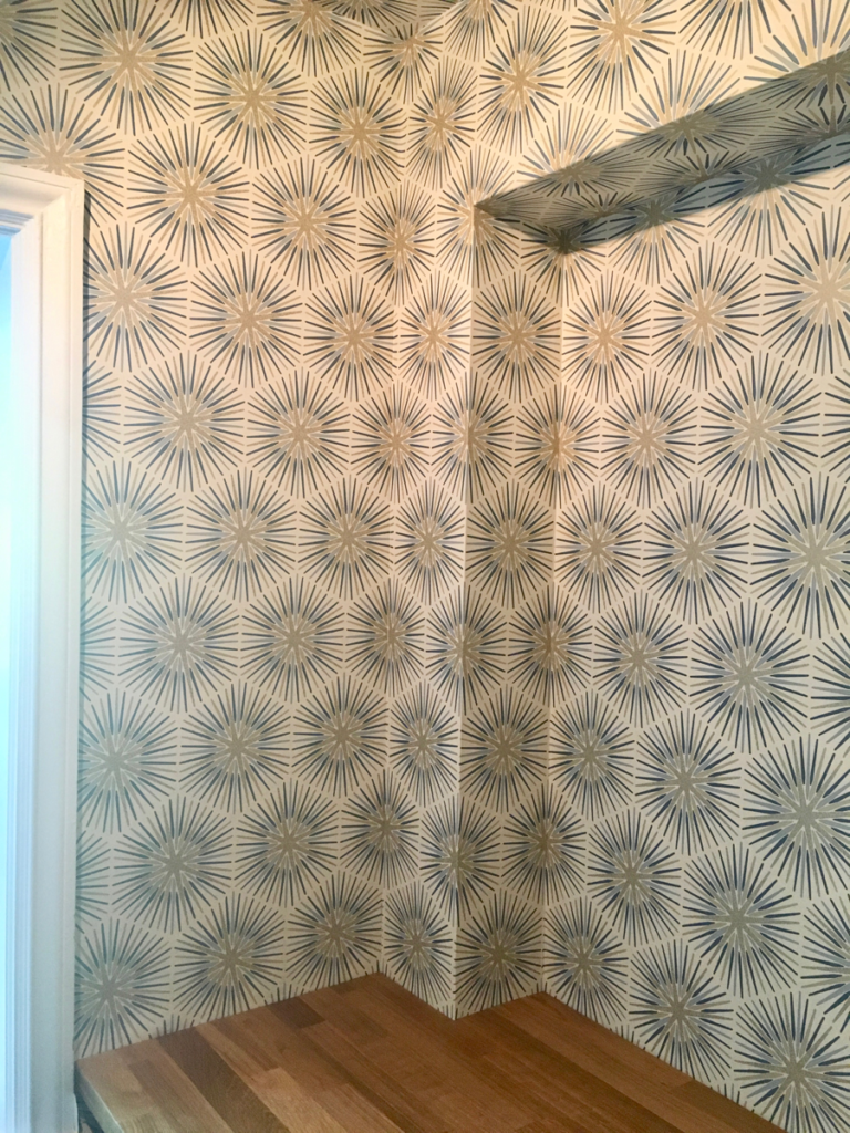
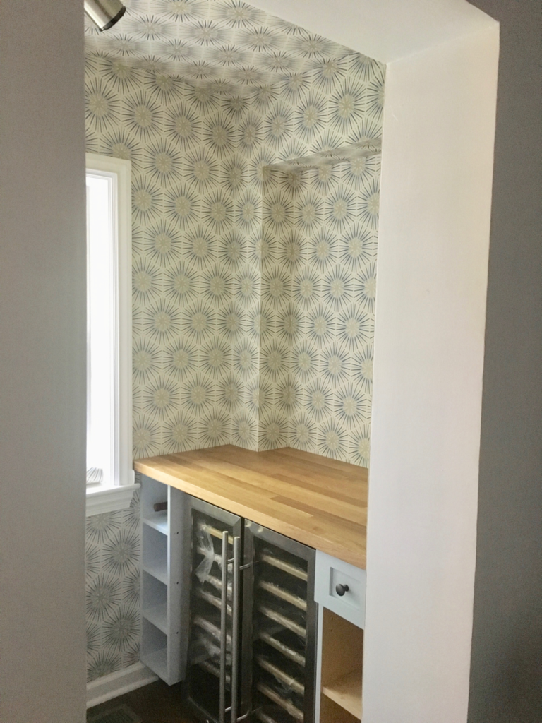
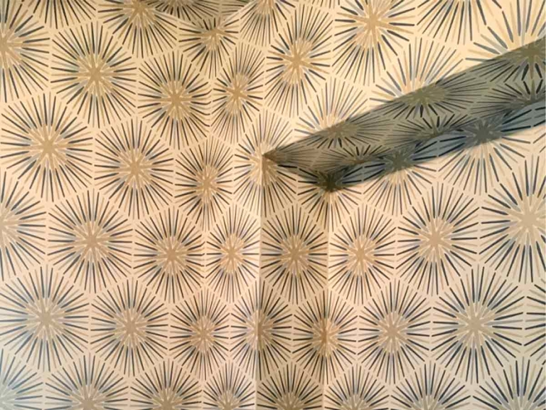
Some architectural aspects and features of the home can not be helped when doing wall paper layout. Wall ends, uneven window heights, uneven or non symmetrical door spacing on the wall. With Linear patterns and prints, it is imperative to see where the symmetry needs to be maintained and lay out accordingly.

This converted bar and wine fridge space has a recessed mirror pocket which is the first thing you see entering the room or from the open door from the formal living room. Maintaining the symmetry of the outside corner and the return to the mirror made this Zoffany Quartz Collection “Spark”pattern look fantastic in this application.

Let's Talk About Your Next Project
Contact us today to discuss how Proper Paint & Paper can help you with your improvements.


